Brand Identity | Packaging
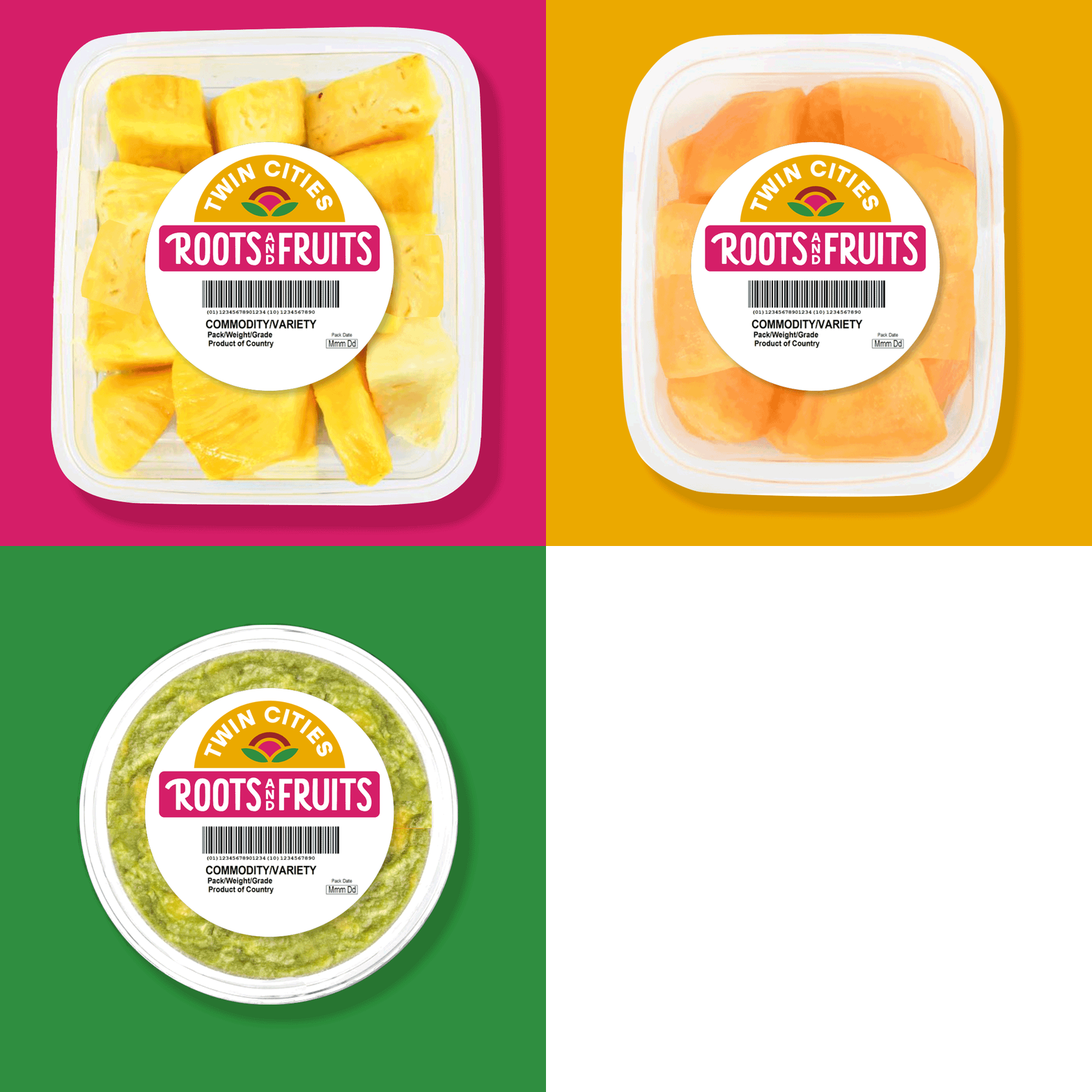
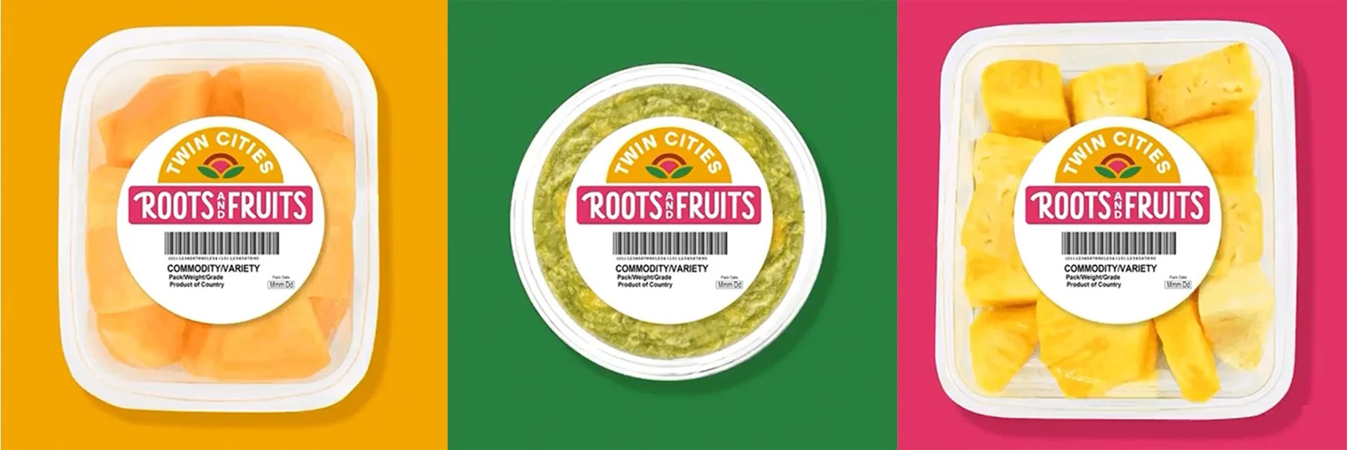
The Twin Cities Co-Op needed a brand and packaging label refresh for their local fresh cut fruits and vegetables pre-cut line, that better represented their local community and strong local food system. This new brand identity reflects a trustworthy, local, fresh and healthy choice for customers on the go, looking for fresh and organic food options on the shelves at their local co-op.
My Role, Designer
Client, Twin Cities Co-Op
Branding | Experiential Design
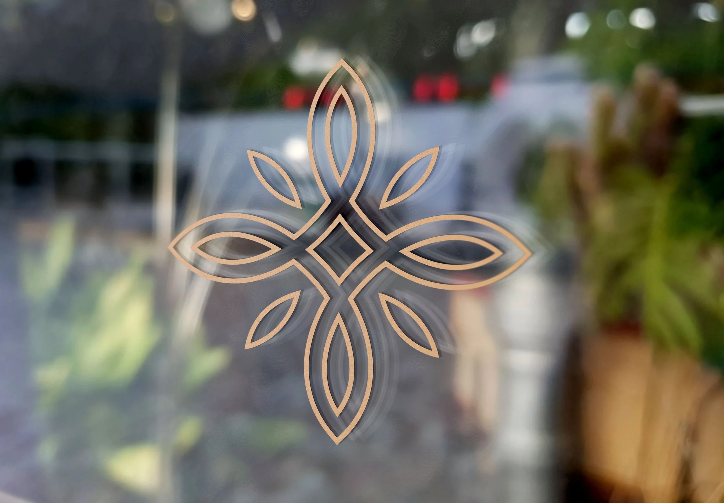
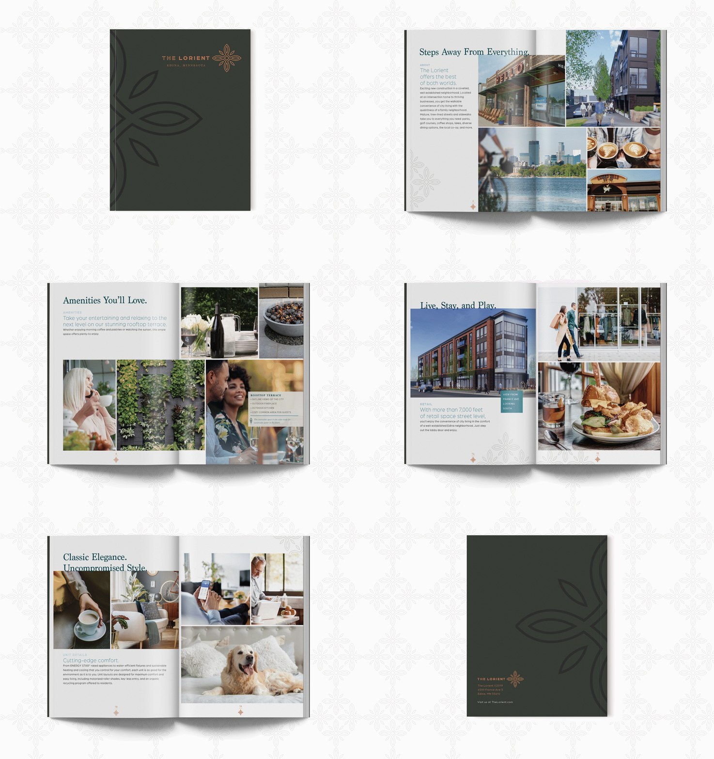
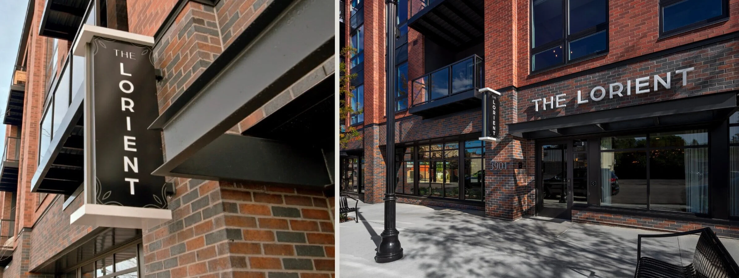
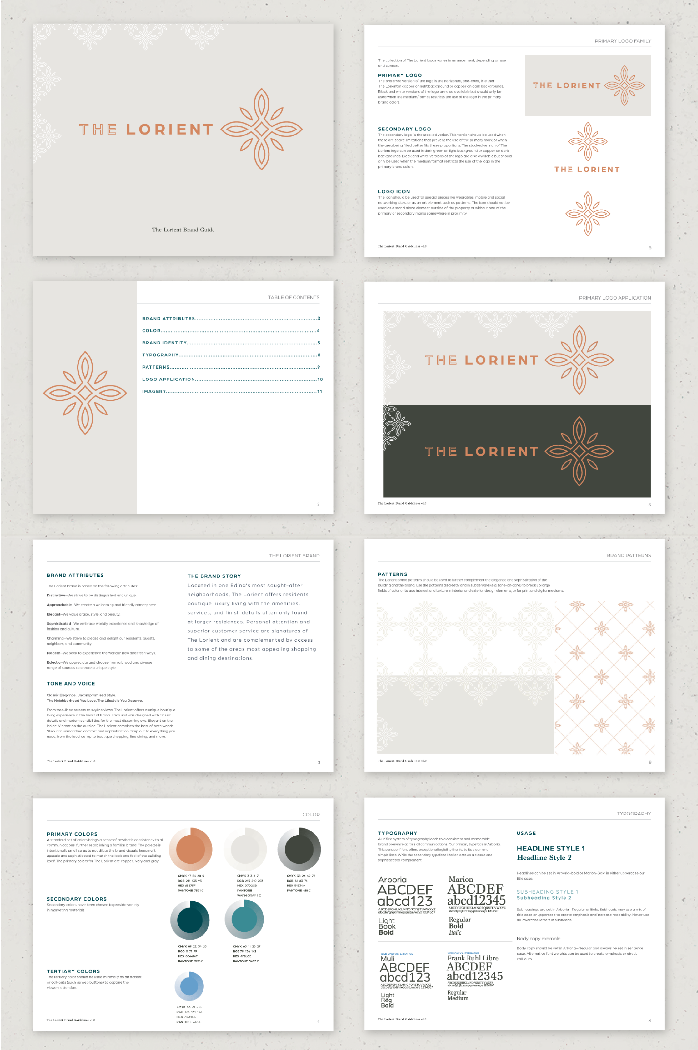
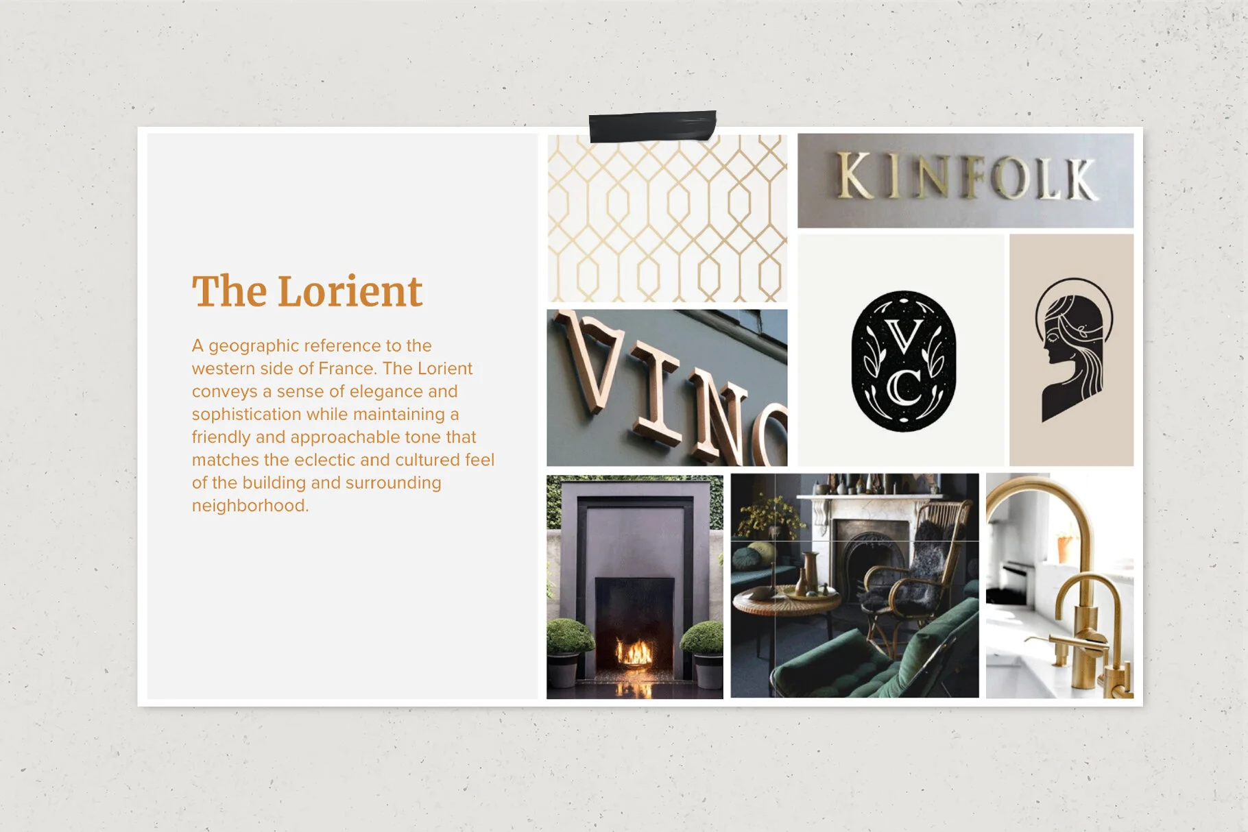
A new high-end residential and multi-use building located in a neighborhood of Edina needed a brand identity. The brand needed to attract and attain residents for this coveted area. The Lorient look is sophisticated and charming with historical nod to the cities Irish heritage to compliment with the surrounding area.
Visit the website
My Role, Art Direction & Design
Creative Director, Jason Hammond
Agency, Bolster
Brand Identity | Website | Merchandise
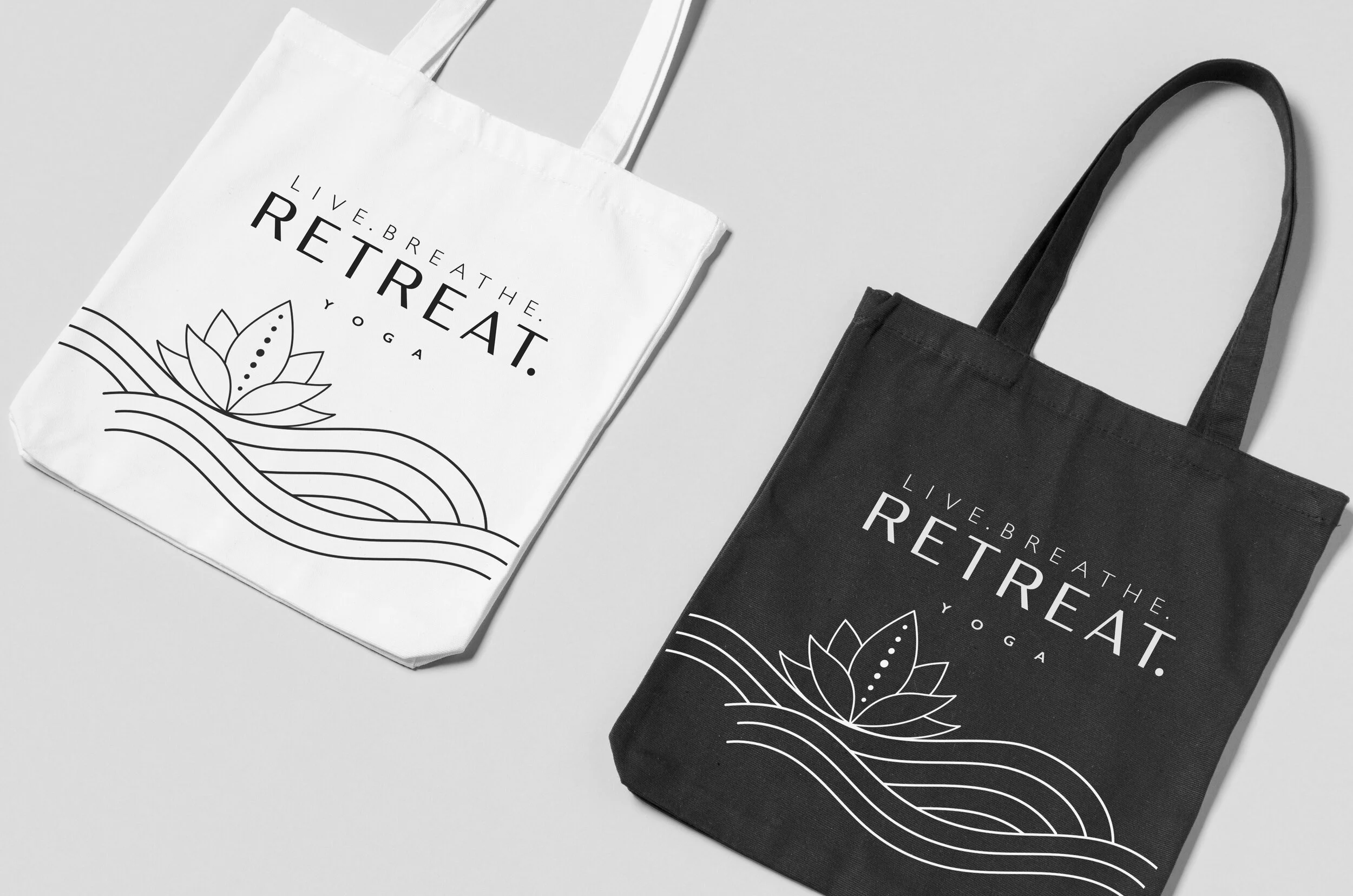
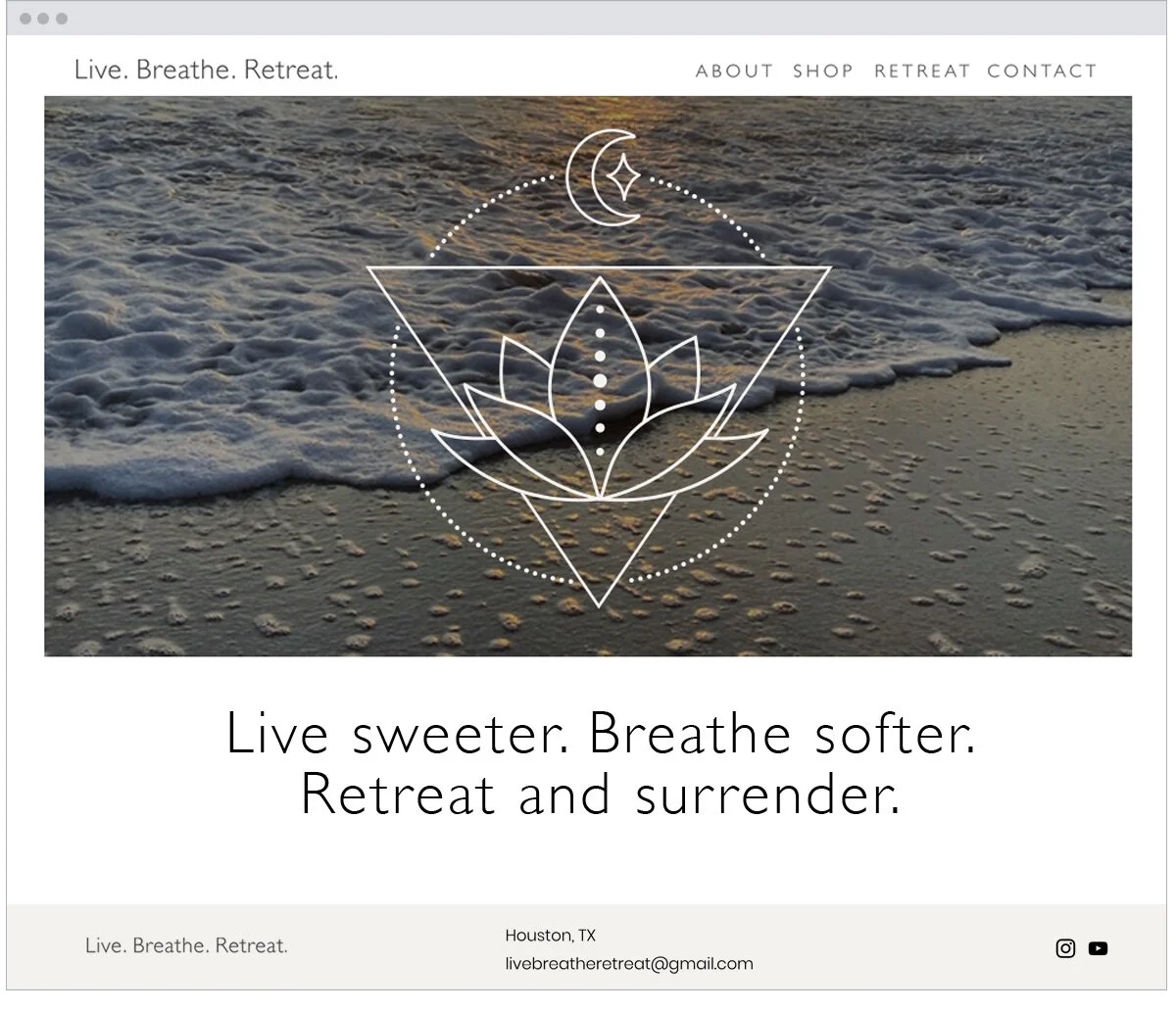
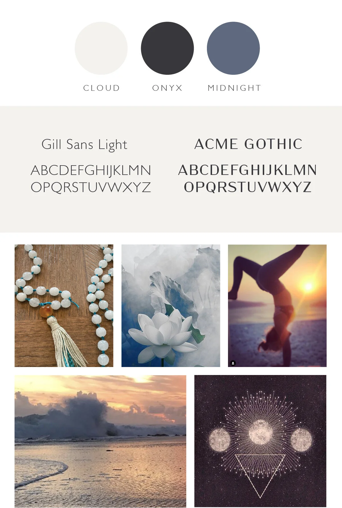
A passionate pair of yoga instructors needed brand identity to represent their new yoga retreat company. A company created with the intention of blending yoga + nature, and inviting every soul to treat themselves to time away so they can reconnect with something so much bigger than themselves. The lotus flower is a huge symbol in yoga practices and symbolizes purity of heart and mind, the seven dots in the lotus are for our chakras, while the moon & star represents being surrounded by nature on every retreat.
My Role, Design/ Art Direction
Client, Angie Fanelli
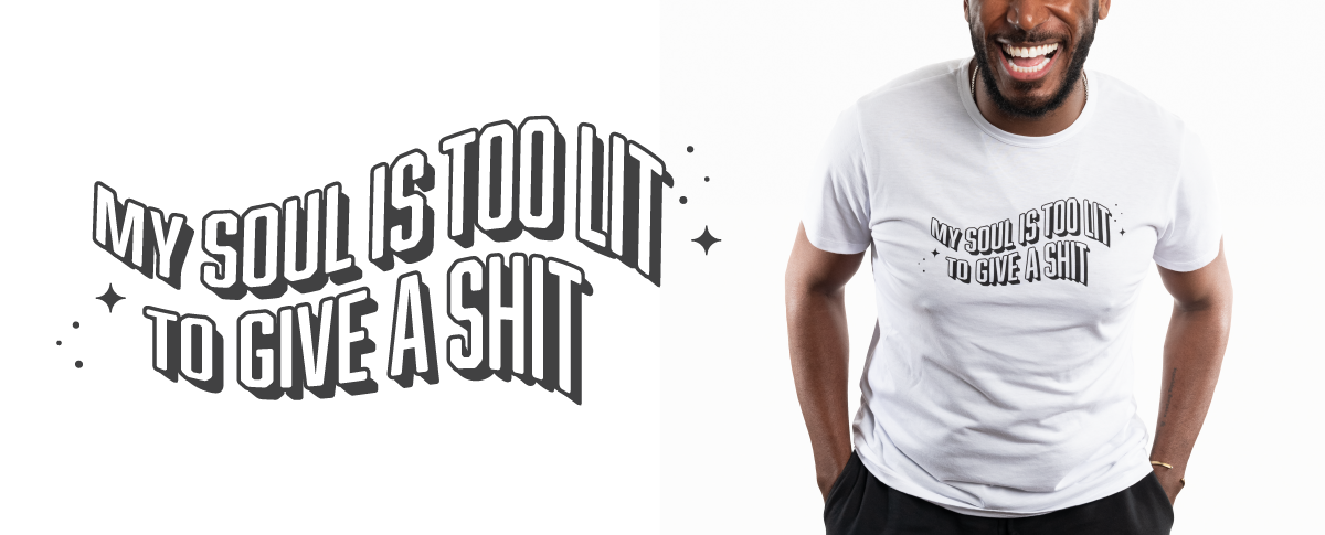
Brand Identity | Apparel Graphics | Website
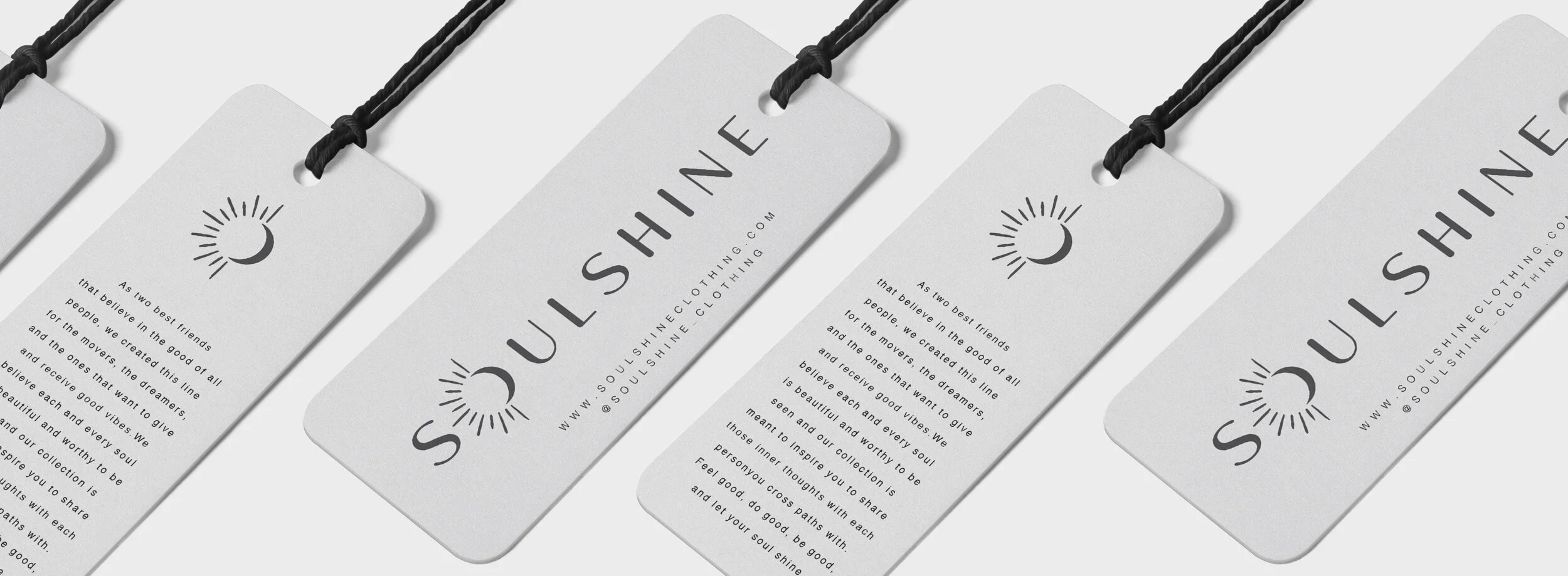
A pair of best friends, soulmates they’d say, wanted to create a clothing brand that reflected their beliefs, that life is all about feeling good and every soul is beautiful. This brand of clothing is for the movers, the dreamers, and the ones that want to give and receive good vibes. Everything from their name, brand identity and clothing collections embodies their mantra, to always feel good, do good, be good, and let your soul shine.
My Role, Designer
Client, Angie Fanelli
brand positioning // brand refresh
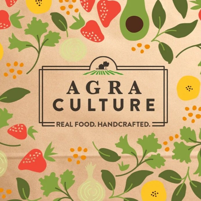
Agra Culture was looking to grow their brand with a stronger identity and perception among current and potential customers. They wanted to keep their current logo but somehow update it to ensure they were communicating clearly they were a restaurant destination for authentic, chef crafted, fresh, real food that was also convenient and affordable. Through an updated brand tagline and visuals, Agra Culture could stand out in a crowded food industry.
Creative direction by Jason Hammond






![Yoga_project_filesBW [Recovered]-06.jpg](https://images.squarespace-cdn.com/content/v1/5ab5e0a74611a0218556d75d/1589766660645-WZPS5LU8TD26QT6VKJPU/Yoga_project_filesBW+%5BRecovered%5D-06.jpg)
![Yoga_project_filesBW [Recovered]-01.png](https://images.squarespace-cdn.com/content/v1/5ab5e0a74611a0218556d75d/1589905327990-V58ESE2VMYJOTKZJ088F/Yoga_project_filesBW+%5BRecovered%5D-01.png)

![Yoga_project_filesBW [Recovered]-05.png](https://images.squarespace-cdn.com/content/v1/5ab5e0a74611a0218556d75d/1589905327745-EP006KYU7SKNTANKMJMJ/Yoga_project_filesBW+%5BRecovered%5D-05.png)
![Yoga_project_filesBW [Recovered]-03.jpg](https://images.squarespace-cdn.com/content/v1/5ab5e0a74611a0218556d75d/1589766661320-C5QN92KTG1L734I0CUGG/Yoga_project_filesBW+%5BRecovered%5D-03.jpg)